Burnt Orange Wedding Signs: Terracotta, Sage, Blush
Use burnt orange wedding signs with terracotta, sage greenery, blush, and copper details for fall, desert, and boho wedding palettes.
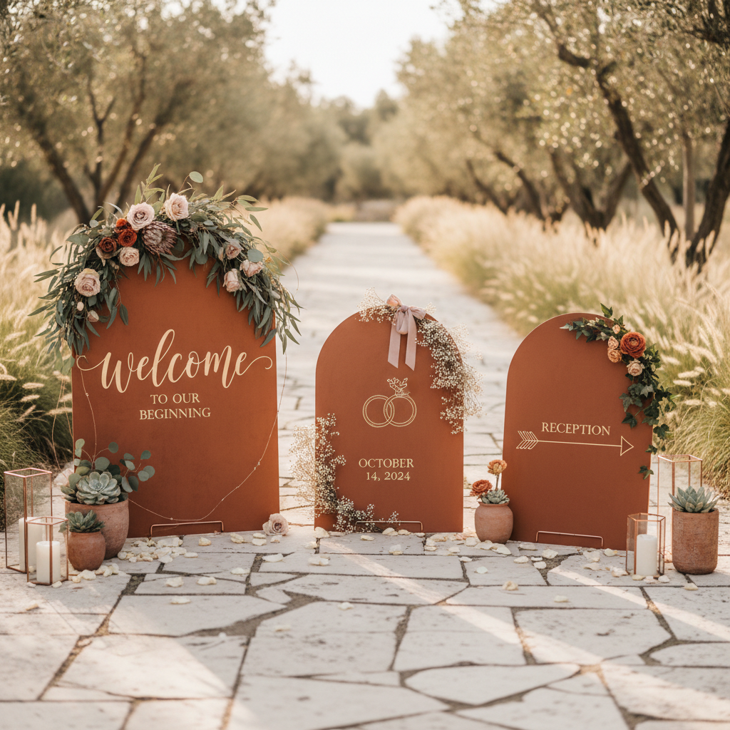
Burnt Orange Wedding Signs: Terracotta, Sage, Blush
Burnt orange wedding signs work because they feel expressive without becoming loud. The color carries warmth, depth, and seasonality, but it can still look refined when it is anchored by neutral materials and readable typography.
For couples planning a fall wedding, desert celebration, or earthy outdoor venue, burnt orange is one of the easiest palette choices to make look intentional. It pairs naturally with cream, sand, soft blush, muted clay, espresso, and brushed gold, which gives you a lot of flexibility across welcome signs, seating charts, bar menus, and directional pieces.
If you are comparing it against broader palette shifts before you commit, start with the wedding sign trends for 2026.
Why Burnt Orange Keeps Showing Up
The color solves two problems at the same time:
- it feels distinctive in photos
- it still integrates well with natural materials
That combination is rare. Some trend colors look strong on a mood board but become hard to print or difficult to reuse across a full sign suite. Burnt orange holds up better because it can act as either the dominant accent or a supporting layer inside a more neutral composition.
Where Burnt Orange Fits Best
This palette is strongest for:
- fall weddings
- desert and canyon venues
- terracotta-heavy design directions
- garden weddings with warm florals
- rustic venues that need a more elevated color story
It can also work in more formal settings if you keep the palette restrained and let the color live mostly in accents rather than the full background.
If you are deciding whether this color belongs in a softer outdoor suite or a wood-led venue look, compare it against our garden wedding signs ideas and rustic vs modern wedding signs guide.
Burnt Orange Wedding Signs Work Best With Terracotta, Sage, and Blush
The combinations appearing most often across editable templates and custom pieces are not orange alone. They usually layer burnt orange with terracotta, sage greenery, blush pink, copper or gold accents, and either watercolor florals or simple botanical line art. That is why the color works so well for boho, garden, and desert weddings. It feels warm without losing softness.
Best Pairings for Burnt Orange Signs
The safest and most flexible pairings are:
- burnt orange with ivory and dark brown
- terracotta with almond and sage
- rust with soft blush and stone
- muted orange with champagne and black
The goal is not to make every sign orange. The goal is to let burnt orange create the emotional temperature of the suite while neutral colors protect readability.
If you want another warm but more material-led comparison, read mirror vs acrylic wedding signs before deciding how glossy or reflective the final suite should feel.
Typography That Works With the Palette
Burnt orange tends to look best when the typography feels deliberate and calm. Overly decorative scripts can make the suite feel crowded fast.
The strongest combinations are:
- elegant serif headline with clean sans-serif body text
- italic serif for names paired with simple uppercase details
- restrained script used for one line only
If you keep the type system simple, the color has room to do its job.
Best Sign Types for This Theme
Burnt orange works especially well on:
These sign types give the palette enough surface area to register without forcing it onto every small-format piece.
Materials That Support the Look
The best material choices for burnt orange signage are:
- matte acrylic, especially for arched welcome signs
- warm white foam board for large-format seating charts
- textured cardstock for smaller pieces
- pedestal program or timeline signs for reception moments
- lightly stained wood when you need extra warmth
Mirror can work, but only if the overall design stays minimal. In most cases, matte materials are easier because they let the color read clearly and photograph consistently.
Common Mistakes to Avoid
The palette starts to break when:
- orange becomes the background on every piece
- the suite adds too many secondary warm tones
- script fonts overpower the content
- contrast gets too soft against beige or blush backgrounds
Burnt orange looks expensive when it is controlled. It looks dated when it is overused.
How to Build the Suite
A simple structure works best:
- Start with the welcome sign.
- Reuse the same typography on the seating chart.
- Carry one accent treatment into menus and directionals.
- Keep smaller signs more neutral than the hero piece.
That lets the palette feel coordinated without making the whole venue visually heavy.
Recommended Next Step
If burnt orange is already in your florals, linens, or stationery, use it as the accent system for your sign suite rather than introducing another competing color family. Then prototype the entrance piece in the creator and pressure-test it against the rest of the wedding sign types before you commit to printing.
Keep Exploring
All Wedding Sign Styles
Browse the full style and color hub for more design directions.
Welcome Sign Ideas
See how this style plays out on the most important sign most couples create.
Create This Style
Use the AI creator to build a sign in this aesthetic with your own wording.