Wedding Details Posters: Infographic Ideas, Sections & Print Tips
Wedding details posters for fun facts, signature drinks, dress code, venue notes, and guest-facing wedding information. Learn what to include and how to print them well.
Wedding Details Posters: Infographic Ideas, Sections & Print Tips
Wedding details poster formats are built for couples who want one display to hold several guest-facing pieces of information at once. A strong wedding details poster can combine signature drinks, fun facts, dress code notes, venue details, welcome messaging, or custom sections into one cohesive design. That makes it one of the most flexible poster types in the current product.
The reason this format works is simple: not every guest-facing sign deserves its own easel. Sometimes you want one poster that captures the personality of the day while also answering practical questions. A wedding details poster sits right in that middle ground.
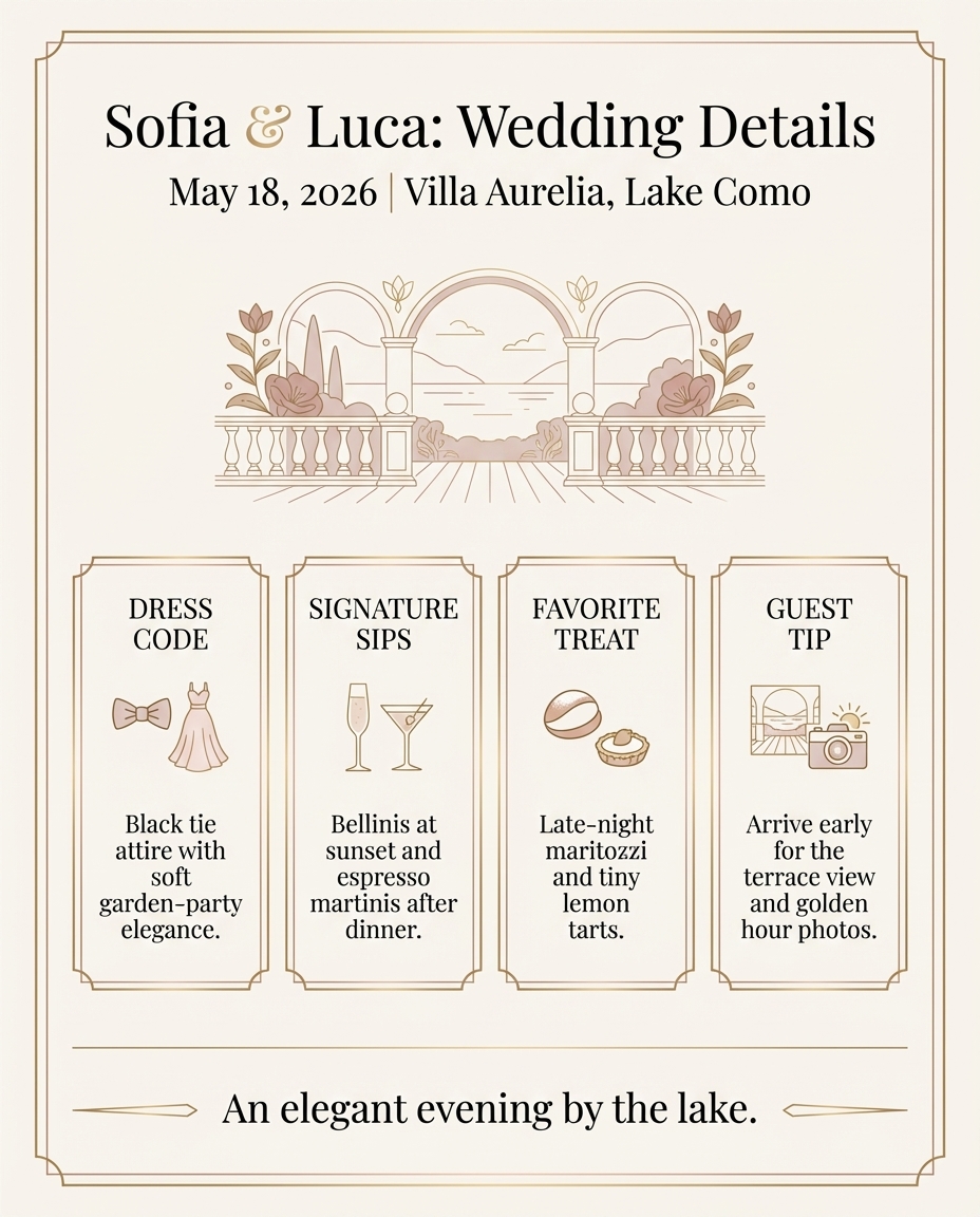
What Goes on a Wedding Details Poster
The right sections depend on the event, but the best wedding details poster layouts usually include three to five information blocks. Useful sections include:
- signature drinks
- dress code
- fun facts about the couple
- venue or weekend details
- hashtag
- wedding website QR code
- favorite local recommendations
- thank-you note
The goal is balance. A wedding details poster becomes much harder to read once it tries to do too many jobs. If you need a full weekend schedule, use a wedding itinerary sign. If you want a more editorial multi-section format, use a wedding newspaper.
Why a Wedding Details Poster Performs So Well
Couples often love this format because it feels highly customized without demanding a full narrative or long schedule. It is especially useful when:
- you have several small pieces of information guests should see
- the wedding style leans playful, editorial, or infographic-led
- you want a welcome-area piece that feels more interactive than a standard sign
- you want to share personality without forcing everything into a love story format
Best Wedding Details Poster Layouts
Section Grid
This is the cleanest approach for most weddings. Each block gets a heading, one short explanation, and enough spacing to stay readable.
Editorial Facts Layout
This works well if the design language leans newspaper or magazine, but it still needs strong hierarchy.
Centerpiece Panel + Supporting Details
Use one stronger central section, such as signature drinks or a welcome statement, then surround it with supporting information blocks.
Wedding Details Poster Section Ideas
Signature Drinks
This is one of the strongest sections for a wedding details poster because it adds personality and helps guests order quickly.
Fun Facts
Short facts about the couple can lighten the mood and make the poster feel distinctively personal.
Dress Code Reminder
This is especially useful if the celebration has a less common dress code or multiple event styles.
Venue Notes
Helpful for outdoor weddings, destination venues, or properties with multiple spaces.
QR Code to the Wedding Website
A QR code can push details that do not belong on the poster itself, like travel, registry, or full event info.
Local Recommendations
Great for destination weddings when you want to share favorite cafés, beaches, cocktails, or neighborhoods.
How Much Text a Wedding Details Poster Should Carry
This is a format where editing matters even more than usual. Every section should feel like a quick read. Use:
- short headings
- one concise sentence per block
- bulleted lists only when the format truly benefits from them
A wedding details poster is successful when a guest can scan it quickly and immediately understand the categories.
Best Sizes for a Wedding Details Poster
The best size depends on the number of sections:
16x20for light, tightly edited poster content18x24for balanced section grids20x30for richer infographic-style layouts24x36when the poster is a focal feature or includes a map plus extra details
If you want a heavy map component, a guest travel map poster is often the better dedicated format.
If you want examples of when the map deserves its own format, review guest travel map ideas before you add geography here.
Wedding Details Poster vs Wedding Newspaper
Both formats support multiple sections, but the tone is different.
A wedding details poster is better when:
- you want a cleaner infographic feel
- you need a welcome-area display
- you want several short guest-facing modules
A wedding newspaper is better when:
- you want a front page and fuller editorial presentation
- you want a love story, schedule, QR code, and games all in one format
- you want a format that could be displayed or handed out
Common Wedding Details Poster Mistakes
Too Many Tiny Sections
If everything is small, nothing feels important.
No Hierarchy
Guests need to know where to start looking first.
Mixing Serious Logistics and Joke Copy Poorly
Humor can work, but not if it makes the practical information harder to find.
Overlapping With Better-Dedicated Formats
If your main need is a schedule, use an itinerary. If your main need is a story, use a love story poster. If your main need is a newspaper, use the newspaper format.
Smart Uses for a Wedding Details Poster
This format is especially strong for:
- cocktail-hour displays
- welcome areas
- destination wedding arrivals
- rehearsal dinner or welcome party signage
- reception entry pieces that complement other signage
Best Wedding Details Poster Combinations
The strongest wedding details poster usually combines one practical category with one personality category and one hospitality category.
Reliable combinations include:
- signature drinks + dress code + QR code
- fun facts + local recommendations + welcome note
- dress code + venue note + transportation reminder
This is the main advantage of a wedding details poster. It lets the couple combine small but useful pieces of information without needing a separate sign for each one.
When a Wedding Details Poster Beats Separate Signs
A wedding details poster usually beats separate small signs when:
- the welcome area has limited space
- the couple wants a cleaner installation
- none of the individual information blocks needs a full easel on its own
That is why wedding details poster formats work especially well for cocktail hour, welcome tables, and hotel arrival areas. They consolidate information without making the space feel cluttered with mini signage.
How to Keep a Wedding Details Poster Readable
The easiest way to keep a wedding details poster readable is to force each section to earn its place.
Use this filter:
- will guests actually use this information?
- can this idea be expressed in one short line or block?
- does it belong here more than on the website or itinerary?
If the answer is no, cut it. A cleaner wedding details poster usually feels more premium and more useful than a fuller one.
That editing discipline is what makes the format commercially strong. A wedding details poster solves the real problem of “too many small guest notes, not enough room for separate signs” without forcing the wedding to become cluttered with micro-displays.
For many couples, that is the whole appeal. One well-edited wedding details poster can replace several weaker standalone signs while still feeling intentional and visually rich.
It is also one of the most adaptable poster types in the whole product set. The same wedding details poster framework can lean elegant, playful, destination-focused, cocktail-hour-driven, or hospitality-heavy depending on which sections are chosen and how the hierarchy is handled. That flexibility is what makes it such a strong commercial format.
That adaptability is also what makes the format easier to justify. Couples do not need a completely new display concept for every venue or wedding style. They need one flexible poster structure that can absorb the right details cleanly.
That is what gives the format staying power. A wedding details poster can feel practical, personal, and visually composed at the same time when the sections are chosen with restraint.
It also gives planners and couples a cleaner answer to a common problem: too many small details worth sharing, but not enough importance to justify a full standalone sign for each one.
That is exactly why the format works best when it stays edited and intentional.
When the hierarchy is clear, guests can actually use it instead of just admiring it.
That functional readability is what makes the best wedding details poster feel complete.
It should feel useful at a glance and polished up close.
How to Build a Better Wedding Details Poster
Start with the sections guests will actually use. Then choose only one or two personality-driven blocks beyond that. That often means combining:
- one practical block
- one personality block
- one visual or hospitality block
That structure keeps the poster feeling useful instead of chaotic.
Final Take
A wedding details poster gives couples a flexible way to combine guest guidance and personality in one print-ready format. It works best when the sections are well edited, clearly prioritized, and printed large enough to be readable without crowding the design.
Create your wedding details poster when you want a flexible infographic-style format. If your main need is travel context, compare guest travel map posters. If you want a richer editorial treatment, compare wedding newspapers.
Quick Editing Test
Print the section list alone before you judge the design. If the headings still make sense without the decorative layer, the poster is doing its job. If the headings feel random, the content mix needs work. That is often the fastest way to decide whether a details poster should stay broad or split into two guest-facing pieces.
Keep the hierarchy obvious. Guests should know what to read first without guessing.
Sources
- Title: 49 Thoughtful Welcome Bag Ideas From Real Weddings Publisher: Martha Stewart Publication Date: November 25, 2025 URL: https://www.marthastewart.com/7919902/welcome-bags-real-weddings
- Title: 10 Essential Wedding Events to Include in Your Planning Timeline Publisher: Martha Stewart Publication Date: April 24, 2025 URL: https://www.marthastewart.com/7860561/pre-and-post-wedding-parties-events
- Title: 16 Times Event Wayfinding Perfectly Blended Style and Function Publisher: BizBash Publication Date: January 21, 2026 URL: https://www.bizbash.com/event-design/standout-directional-signage-at-events
Keep Exploring
Guest Travel Map Ideas
Add guest origins or a destination map to a richer wedding-details poster.
Guest Travel Map Posters
Turn the guest-origin concept into its own dedicated display if you want a bigger map feature.
Create a Wedding Details Poster
Design a facts-and-details poster with drinks, fun facts, schedule notes, and custom sections.