Editorial Wedding Signs for Modern, Newspaper-Inspired Wedding Design
Editorial wedding signs use strong typography, confident layouts, and newspaper-inspired structure to create modern welcome displays, itineraries, newspapers, and event signage.
Editorial Wedding Signs for Modern, Newspaper-Inspired Wedding Design
Editorial wedding signs are one of the clearest ways to make a wedding look current without relying on a heavy color theme or overly decorative florals. The style comes from hierarchy, typography, spacing, and tone. That is what makes editorial wedding signs different from more traditional romantic or rustic suites. They feel intentional, fashion-aware, and structured in a way that looks closer to a magazine spread or newspaper layout than a conventional wedding template.
That is also why editorial wedding signs have grown into more than a one-sign trend. The style now extends naturally into wedding newspapers, order of events posters, welcome displays, seating charts, itineraries, and details boards. It gives couples a full system rather than one aesthetic moment.
This guide covers how editorial wedding signs work, what makes them different, which sign types they suit best, and how to build the style without making it feel cold or overdesigned. If this is your direction, you can create the suite in AI Wedding Signs.
What Makes Editorial Wedding Signs Feel Editorial
Editorial wedding signs are less about decoration and more about composition.
The style usually includes:
- strong typographic hierarchy
- confident scale shifts
- clean negative space
- restrained color use
- sharp section structure
- a little attitude in the wording or layout
That does not mean every editorial wedding sign has to be black and white, but the palette is usually restrained enough that typography becomes the main event.
The overall effect feels curated, not busy.
Why Editorial Wedding Signs Work So Well Right Now
Editorial wedding signs work because many couples want wedding design to feel more personal and current, but not overly crafty or overly ornate. Editorial styling answers that with:
- cleaner layouts
- fewer filler embellishments
- better information hierarchy
- easier extension into posters and printed collateral
It also photographs well. Strong type and clear contrast tend to hold up better in event photos than delicate design systems that disappear in dim lighting or busy spaces.
The Main Branches of Editorial Wedding Signs
Editorial is a broad category. It helps to split it into branches.
Newspaper-Inspired Editorial
This direction borrows from print journalism:
- mastheads
- columns
- section labels
- bold headlines
- issue-style framing
It pairs naturally with a wedding newspaper and related poster formats.
Fashion-Led Editorial
This direction feels more magazine-inspired:
- large names
- sharp serif typography
- dramatic spacing
- more minimal decoration
It works well for black-tie, city, and design-heavy weddings.
Minimal Editorial
This direction keeps the hierarchy but softens the drama:
- fewer visual elements
- stronger white space
- small supporting lines
- very clear structure
It works well when couples want the editorial feel without leaning too hard into newspaper cues.
Best Sign Types for Editorial Wedding Signs
Welcome Signs
Editorial welcome signs work best when the copy stays short and the layout has space. A powerful headline treatment often does more than decorative framing ever could.
Good choices:
- names as the hero
- welcome line as supporting text
- date or city as a small supporting line
This works especially well for couples who want the entrance to feel like a statement instead of a floral frame.
Itinerary Signs
Editorial wedding signs are a natural fit for itineraries because structure matters. Headings, time blocks, and section labels look stronger in editorial layouts than in many purely decorative styles.
This is one of the best formats to pair with the style:
Order of Events Posters
Order-of-events posters benefit from the same hierarchy. Editorial styling helps:
- separate event blocks
- keep times readable
- make the poster feel bigger
- add mood without hurting clarity
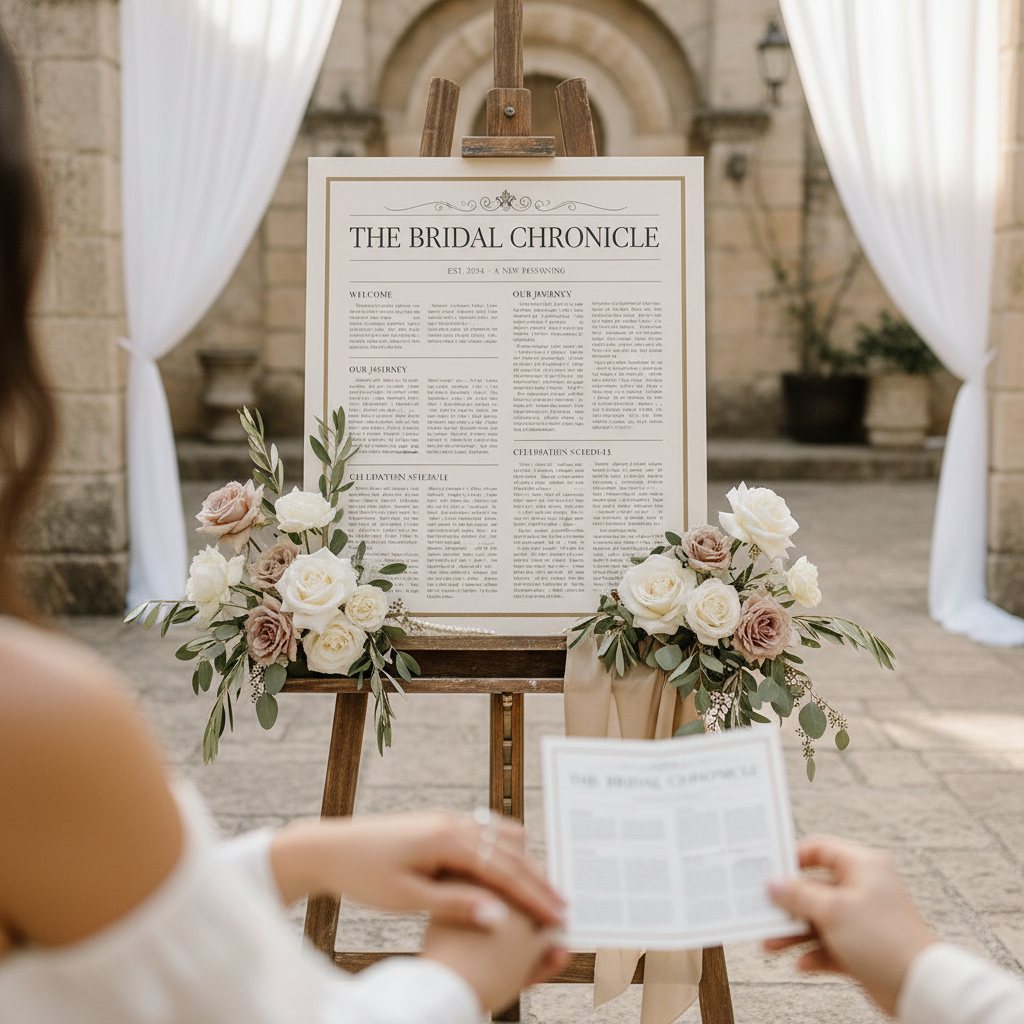
Wedding Newspapers
This is the clearest extension of the style. If you love editorial wedding signs, the newspaper format is often one of the strongest companion pieces because it lets the theme expand into a richer storytelling object.
Seating Charts
Editorial styling can make seating charts feel much more refined, especially when guest names are organized with strong headings and clean spacing. What matters is keeping function first.
Typography Rules for Editorial Wedding Signs
Typography is the backbone of the style, so the font choices matter more than usual.
Strong editorial combinations:
- high-contrast serif + clean sans
- one confident serif family used at multiple scales
- all-caps supporting labels with a refined serif headline
Good editorial type behavior:
- big scale differences
- short lines
- clean alignment
- selective bolding
Weak editorial type behavior:
- too many scripts
- decorative flourishes that undercut the structured feeling
- inconsistent font voices across the suite
If the typography is generic, the sign will not feel editorial no matter how much white space it has.
Color and Material Choices for Editorial Wedding Signs
Editorial wedding signs often work best in restrained palettes.
Strong directions:
- black and white
- ivory and black
- cream and charcoal
- warm neutral with dark text
- occasional muted accent tones used sparingly
Strong materials:
- matte board
- framed fine-art prints
- acrylic with clean type
- poster stock for newspaper-inspired pieces
If you want the style to feel luxe, keep the material finish calm and let the layout do the heavy lifting.
How to Make Editorial Wedding Signs Feel Warm, Not Cold
Some couples love the structure of editorial wedding signs but worry that the suite will feel too sharp. Warmth comes from the surrounding choices:
- candlelight
- textured paper
- softer florals
- cream instead of stark white
- warmer serif faces
- more personal wording
You do not need to abandon the editorial structure to make the room feel inviting.
Editorial Wedding Signs by Wedding Type
City Wedding
This is one of the strongest matches. Editorial wedding signs feel right at home in lofts, galleries, hotels, and restaurant venues.
Black-Tie Wedding
The style works well here too, especially when the typography leans formal and the palette stays minimal.
Destination Weekend
Editorial structure is great for itinerary pieces, newspapers, and guest guidance. It keeps the weekend looking cohesive and considered.
Fashion-Led Creative Wedding
This may be the most obvious fit. If the wedding style references fashion shoots, magazines, or modern editorial imagery, the signage should carry the same language.
The Best Editorial Wedding Sign Pairings
If you choose this direction, these pairings tend to work especially well:
- black and white wedding signs
- wedding newspaper
- order of events poster
- photo love story poster
- wedding details poster
That makes editorial one of the easiest themes to scale across both signs and posters.
Common Mistakes With Editorial Wedding Signs
Using Generic Template Type
If the typography does not have character, the style falls flat fast.
Confusing Sparse With Intentional
Editorial layouts need structure. Empty space without hierarchy just feels unfinished.
Adding Too Many Decorative Touches
If you overload the design with scripts, floral borders, or ornaments, it stops feeling editorial.
Forgetting the Guest Experience
The style should still help guests read the sign quickly. Information hierarchy cannot become a purely aesthetic exercise.
A Strong Use Case for This Theme
Editorial wedding signs are a great fit when you want your wedding to feel current, elevated, and visually confident without relying on a heavy decorative theme. The style works across commercial sign types, but it gets especially strong when it expands into newspapers, itineraries, and larger poster pieces.
Use AI Wedding Signs to create editorial wedding signs that fit your venue and tone, then extend the look into a wedding newspaper, order of events sign, wedding itinerary sign, or black and white wedding signs suite. The strongest editorial systems do not just look trendy. They make the whole wedding feel more sharply designed from entrance to last call.
How to Keep Editorial Wedding Signs From Feeling Like a Gimmick
Editorial wedding signs can look dated fast if they lean too hard on novelty. The goal is not to make every piece imitate a newspaper headline for the sake of it. The goal is to use editorial structure where it actually improves the design.
That usually means:
- one or two strong headline moments instead of constant visual shouting
- section labels that help guests scan information faster
- cleaner copy with fewer decorative filler lines
- materials and spacing that still feel wedding-appropriate
When the style is handled well, guests may not even think “editorial” first. They will think the suite looks sharp, current, and unusually well organized.
Editorial Wedding Signs for a Full Welcome Installation
One of the best uses of editorial wedding signs is a larger welcome installation. This can include:
- a welcome sign with names-first hierarchy
- a wedding newspaper stack or display
- an itinerary poster
- a details board with QR code or signature drinks
All of those pieces speak the same design language naturally. That is why the theme works so well for couples who want the entrance to do more than greet guests. It can become the main visual system for the weekend.
Sources
- Title: 30 Creative Wedding Signs That Will Welcome or Direct Your Guests Publisher: Martha Stewart Publication Date: May 12, 2023 URL: https://www.marthastewart.com/7934526/signs-real-weddings
- Title: 16 Times Event Wayfinding Perfectly Blended Style and Function Publisher: BizBash Publication Date: January 21, 2026 URL: https://www.bizbash.com/event-design/standout-directional-signage-at-events
- Title: 2010 ADA Standards for Accessible Design Publisher: ADA.gov Publication Date: September 15, 2010 URL: https://www.ada.gov/law-and-regs/design-standards/2010-stds/
Keep Exploring
Wedding Newspaper Templates & Creator
The editorial theme extends naturally into newspaper-style wedding pieces.
Black and White Wedding Signs
Use monochrome styling if you want the editorial direction to feel even cleaner and sharper.
Create Editorial Wedding Signs
Build a typography-led welcome, itinerary, or poster suite in an editorial style.